We have no clever name for it, because it's that simple. We are making transit usable.
We're not talking about the total coverage or depth of the transit network – that's another conversation. We are talking about making the most of our existing system. That is what builds momentum to expand.
We admit: it's possible that, for your commute, transit just isn't happening. We're aware that our current system has some limitations. If the routes and times don't work out, you have a perfectly good excuse not to use transit. We hope to meet your needs in the near future.
On the other hand, your commute may be ideal for transit. Usability removes the excuses not to try transit – "I don't know where the bus goes!", "I don't know how to pay the fare!", "Huh? We don't even -have- a transit system!". If you're saying things like that, it's because we transit folk weren't always seeing our product in the big picture.
Now we are. Usable transit opens up a full range of information and tools – the stuff you need to commute confidently. With these resources at your fingertips, we encourage you to give us a spin. Really. Then, you choose your best commuting option.
We've adopted usable transit fundamentals throughout our system and our organization. Our planners get it, our marketing people get it, our customer reps get it, our front-line staff get it.
See what USABLE TRANSIT is all about >>
Kudos to our fellow transit systems which have pioneered usable transit. Here's a few photos of our favorite principle – either in action or desperately absent. Hover to look closer:
-
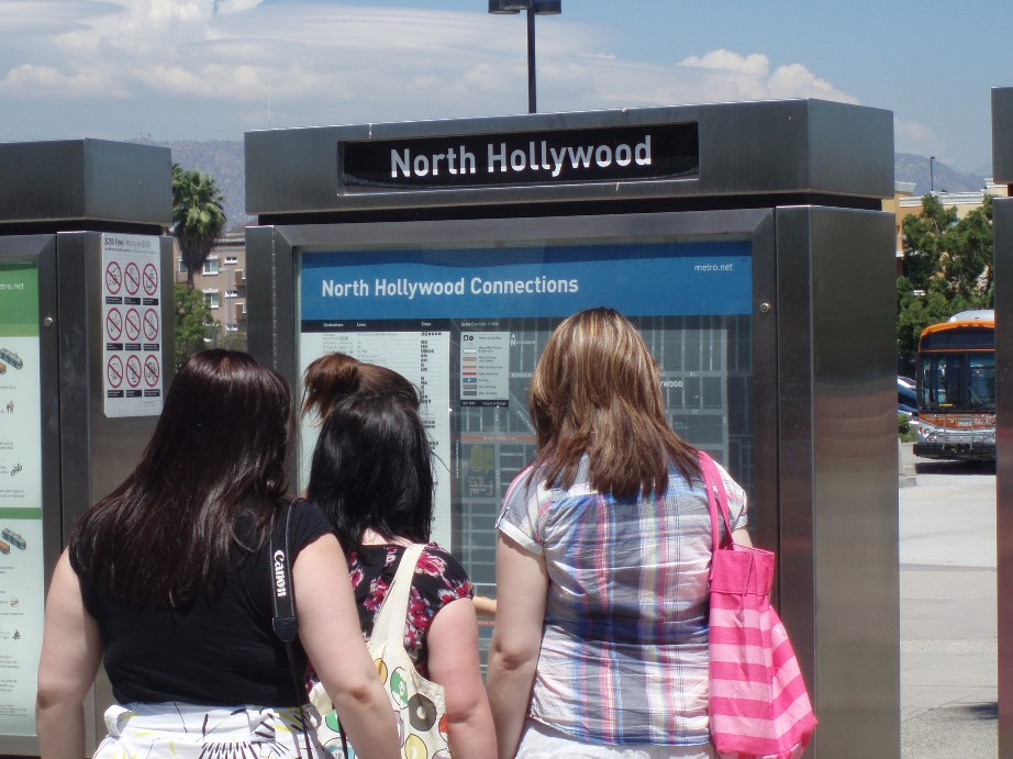

- So that's where those trains go!
-
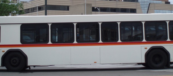

- Buses don't have to look like this.
-
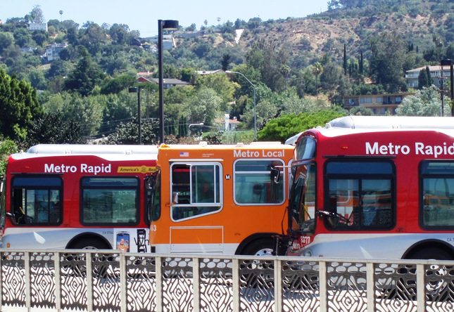

- See?
-
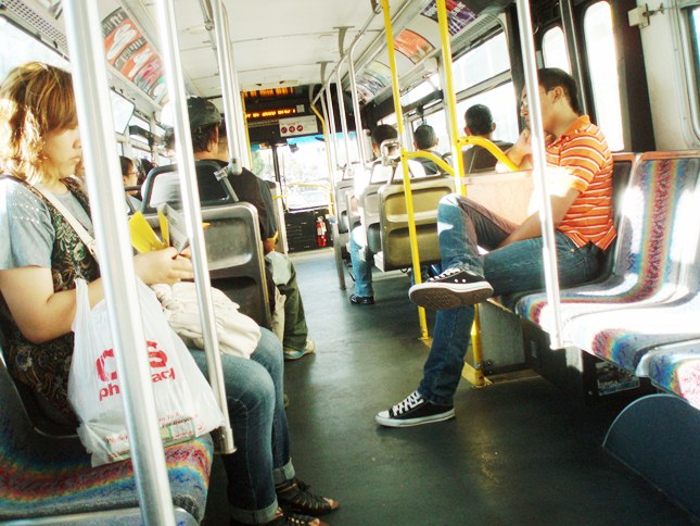

- Stretch those legs and bask in the natural light!
-
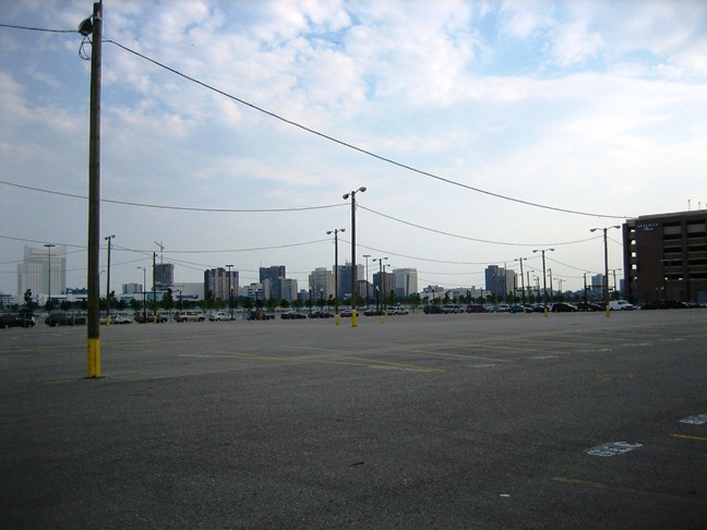

- Without transit options, parking strangles our cities.
-
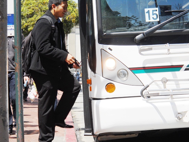

- Step right on!
Friendly
Our employees aren't just employees, they are ambassadors. They are people people. As you get a feel for using transit, we know that some questions might pop up. If anything is unclear along the way, just ask! We are here to help. No joke.
We keep it upbeat. You'll never hear us use anti-customer words like policy, as is "sorry, that's our...", or passenger, as in "human cargo". We want your business – and we think you'll appreciate our positive, customer-centric vibe.
Easy
We create transit services that you can understand – easy access, intuitive routing and minimal zig-zags. If you can read a clock and follow a line with your finger, you're already there!
From the website to the schedules to the bus stops to the vehicles, you'll see a consistent, familiar identity for each transit service. It's the reassurance you want from your transit system.
Paying your fare is about as tricky as using a vending machine – only we're more forgiving of experienced dollar bills. On the bus, slip two bucks into the farebox. At the rail station, follow the interactive instructions on ticket dispensers. What'd we say? Easy.
Convenient
Our rail stations and bus stops are in great locations – you're taking transit to get somewhere. We'll never push you to a windswept parking lot or an out-of-the-way transit center to access the system.
Whereever you board, you'll find ample information about the transit services available. Bigger locations have other amenities, too.
On the regional rail system, we snap schedules to popular commute times. On the bus system, we aim for frequent service from morning to evening – it's worth planning your trip ahead of time, but missing a bus won't destroy your whole day.
Bright
Smile at the thought of your commute. It's a natural reaction when you use Freshwater Railway: our vehicles are accessible and welcoming. Our colors are vivid. Our system has personality.
Riding transit shouldn't be a drab, institutional experience. We make it "fun and comfortable" without compromising the "safe and reliable".
Shout it from a rooftop: you use transit and you're flippin' proud of it! (our rooftop is available for shouting twice a month...)
Visible
Do you see a bus or a train? It's our goal for you to say "how can I use it?" rather than "get that thing out of my way!"
Some transit systems have totally sacrificed their identity. They've plastered their vehicles with ads for movies, french fries, and other things you already know. Either that, or they just have nondescript vehicles to begin with.
We say, nonsense! Our vehicles are all over the place! Could we possibly ask for a better tool to showcase where we go and when we're there?
We forego minimal ad revenue in a quest to earn more customers. If you see a clean, attractive option, you'll at least consider it. We like chewy caramel and creamy nougat as much as anyone, but we don't want to squint through a picture of it on our commute.
Smart
This one's obvious. The practical reasons to use transit are so numerous, we can't fit them all in this tidy little box. So here's a sampler:
A round-trip commute on Freshwater Railway costs as little as $4 – even less if you invest in a pass. The only way to save more cash is to walk or bike (options which we fully endorse, BTW...)
One full bus carries 50 people. One full train can accommodate 900 people. With those two examples, we've already taken 948 tailpipes off the road. Imagine what happens when the whole system is operating, even at partial capacity. Is it just us, or is the air purer?
Parking lots aren't very memorable. And they're sure not a good way to use land in popular areas with growth potential. With effective transit options, we don't have to build thousands of new parking spaces for every new destination.
See what we're getting at? The ripple effect of transit is huge. You share in those pluses when you're a transit customer.


